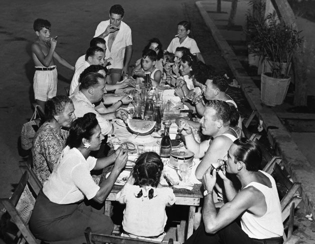
what makes people happy in general? research
What makes people happy in general?
-
Family
-
Video games
-
Friends
-
Career
-
Creative Project
-
Following dreams
-
Finishing high school
-
Food
-
Little things
-
Personality traits. (Extraversion, Optimism, Resilience have a strong positive relationship with happiness)
-
Health and well-being
-
Good mental health
-
Volunteering
Research that i gathered through research papers links:
-
Personality traits (https://greatergood.berkeley.edu/article/item/how_does_your_personality_affect_your_happiness)
- Health and wellbeing (https://www.frontiersin.org/journals/psychology/articles/10.3389/fpsyg.2024.1396543/full)
Students (5-12) –
-
Hide and go seek, play fun games with friends, legos, swimming, humor, connection with family, going out of the house, enjoying childhood, new things, seeing friends, video games.
Students (13-18) –
-
Family, career, sports, doing new things, food, good grades, friendship, supportive relationships, confiding in themselves, leisure, music.
Parents / Staff (25-50) –
-
Doing things they love, pets, reading, writing, music, family, simple things in life, healthy, progressive, childern, career, swimming, food, coffee, old friends
Over the past two days we have been gathering primary information about the WSO community and what happiness means to them and we have gathered a pie chart and information about what students and teachers think matters. After gathering information since we did this the old fashioned way we started counting down each and every answer and how many students / teachers have said the same thing making us narrow down to a specific answer for what the WSO community really values.


As we were gathering primary research we made sure to compare it with the secondary research and if it really is true. My friend and i decided we were going to see for ourselves and this is what we found out:
What makes the WSO Community smile primary research
Students (13-18) –
-
We asked around and this is what we found out.
-
28.1% of students aged 16-18 love sports
-
18.8% of students love family
-
25% of students love food
-
28.1% of students love friends.
-
I noticed students aged 16-18 have the highest percentage among other data and the reason why is because they could be exploring deeper and societal expectations when it comes to friends, family and just overall life. These factors define their values and can influence how they view happiness & social belonging since students aged 16-18 are most likely to be influenced by peer acceptance and group norms (Research from 'The Crucial Trio for Adolescence Happiness' by Jisem journal.
Parents / Staff (25-50) –
-
48.4% of parents & staff value family.
-
25.8% love sports
-
12.9% love students
-
12.9% love friends.
-
This makes family the biggest contender.
Color psychology –
I researched the relationship between emotions and showed us a picture of a yellow stickman in class. It's said that if yellow is your favorite color you're a little more risk-taking than the typical person. I believe that I experience feelings of happiness and other positive emotions when I stare at my favorite color, I feel that it has the same impact on me as it does on others who would consider blue or yellow to be their favorite color that brings them joy, even though it may not be the same as everyone else's opinions.
Emotional marketing –
I think to me what emotional marketing means is to enforce a strategy to connect with human beings on another level such as emotions. It persuades them to engage with the brand as it gives them memorable connections solely because of the storytelling and direction it has gone. I feel like this started reinforcing my own idea because that is very appealing to me personally, an informational and emotional advert can target an audience that eventually connects with the brand’s / client’s intentions fostering brand loyalty.
All research analyzation / findings from:
- emotional marketing research with 5 adverts
- Structures of TV adverts, style of TV adverts, codes and conventions, techniques for 5 adverts.
- Initial ideas
‘Redbull gives you wings’ –
In the video they displayed bright colors to invoke a sense of hope, the reason why Redbull does this was to make the viewers / target audience hopeful in terms of sports and productivity. The story that was told is that you can do anything your mind tells you to do no matter how tough the challenges may be. This creates a great bond with the viewers and the brand because of their diligence and their efforts to connect on a personal level. Inspires the impossible
‘Old spice’ –
In the video they also displayed beaming colors and were trying to make others smell good and to smell “like a man” with a sense of humor projecting a stereotypical image. Connecting with those who have devotion to online pop culture and meme culture for their jokes. Create a movement or community. Project an ideal image
‘NewBalance FuelCell Rebelv5. Move your speed.’ –
In this video new balance uses a color palette with shades of green and grey. This compliments the outdoors and running environment making the color grading a fashionable and intelligent choice to truly make the shoes shine. It tells us the story of a man in Japan who is a cafe owner sharing his real-life conncetion to running and gives us an insight about everyday athletes which is new balance’s (NB) target audience promoting values of speed and for the running community. We can see this through the cinematography and how it is paced. Tell a story.
‘Greatness. It only takes everything | Rafael Nadal | Nike.’
The B&W color scheme shows raw emotion and timelessness hence the cinematography and the way it was created. This shows Rafael’s dedication to his sport helping and supporting athletes and Nike’s decision to foster human connection within the sports industry and impact those who need it. This further motivated me by demonstrating Nike’s unwavering commitment to connection. Inspires the impossible.
‘Honda | Unstoppable Dreams’
This advert narrates the story about racing figures who overcome self-doubt and setbacks to achieve ultimate success demonstrating their spirit of relentless drive and resillience. Honda uses a profound narrative to evoke deep emotional engagement that viewers can relate to on a personal level. The gloomy / dark color scheme shows their emotions and the setbacks that they might be going through. Choosing a strategic emotional marketing approach that connects with consumers and fans of Honda. Know your audience, Tell a story, Inspire the impossible
‘Is it even a city? – Oslo’
This advertisement shows an ironic non-idealized personal view of Oslo. Despite the cynical opinions about it the reason why this can be viewed as a great advert is because as he tries and compares other countries you can see that it embraces Oslo’s calm and easygoing nature using these as benefits rather than a disadvantage compared to cities like New York and Paris. Anti-advertisement that worked well in Oslo’s favor making this an excellent tourism advertisement. Create a movement or community. Project an ideal image.
‘Every table has a story’ | Starbucks UK
This advert uses a continous color scheme to tell a tale of a girl who is a frequent regular at Starbucks. The story being told here is that the girl is trying to make it work for herself. Her story is shown through storytelling and daily life moments being shown in Starbucks making it relatable for others also in the working sector. The color grading employed here produces a warm tone color scheme that follows her throughout her life. Emphasizing the changing seasons and her life aswell. It shows rejection and how she is able to navigate that which also follows under the emotional marketing umbrella. Inspire the impossible, Tell a story, Understanding the importance of colour.
Analyzing the structure of TV adverts, style of TV adverts, codes and conventions, techniques for 5 adverts
This ad includes a realistic narrative because of its ability to exhibit how motivation and scenarios in ordinary life, it gives the viewers accuracy about how thrilling it is to have a life filled with sports and how al the negative feelings of competition and championship comes success and hardship. The style also gives the viewers a more nostalgic point of view since all of these are all real-life experiences that can be associated with the viewers and make them feel recognized and appreciated since a sports brand is trying to be relatable and connect with its customers on a deeper level. All the camera angles and shots are purposfully in a way to showcase the girls' stories and how despite the girls being different from one another (with sports) they still have that strength and strive to be the greatest. The iconography being used here is nike which is a global footwear brand. The editing is deliberately made to match with the beats of the music (jersey club) and shows great use of highlighting the tension of the advert and the feel-good song, the color grading being used on this advert is kind of a red-yellowish color which is a very popular color preset thats used in adverts in modern day time. They use natural lights and some spotlights in the scenes which unveils the realistic narrative being utiilizied which makes the big part into shaping it all together despite the gorgeous lighting and camera shots, the color grading, motion blur, slow motion / speed ramp was an excellent finishing touch while editing because without any of the sort it would not excel as the final product did and i think that was genius. The message in the advert is overt and tries to show compassion and perseverance because of the obstacles they've all had to undergo. No celebrity endoresement was used for this advert but i believe it makes it better since it really shows the authenticity being held here.
This ad expresses a realistic narrative by talking about environmental changes and how we can improve our plastic use and recyling, encourages viewers to adopt more sustainable habits & to show nature in its purest. This advert comes off in a dramatic tone which stems from a clear intent to make people aware of the ecological challenges we currently face. Every camera angle is carefully selected to illuminate to show an individual's life and the detrimental demise of angle is carefully selected to illuminate to show an individual's life and the detrimental demise of how not taking care of the earth can impact it negatively, even using film cameras to evoke a comforting sense of "home" since IKEA is primarily known as a global home retail brand. The iconography being used here is IKEA which might seem uncommon due to it being a global home retailer service for those interested in buying stuff for their home. Lighting being used here is all natural which is what pulls it into a realistic narrative especially as a company who make sure to be environmentally friendly through their material sourcing and manufacturing. Energetic music is being used here with ambient sound effects of nature with a voice over of a girl talking about eco friendly habits we should implement. The editing here displays cut scenes of individuals and footage of trees to showcase the thing IKEA is trying to advocate for, there is barely any SFX used here but another editing i would like to point out is that they used as well is color grading and speed ramping. The message is overt and talks to us through an emotional response and concern about our earth and tries to provide a solution to a problem which is looking out environmentally. Notably, no celebrity endorsements are used, ensuring the story centers on everyday people and authentic change.
This video includes an unrealistic narrative. It gives us insight about a humorous, dramatic and surreal experience being happening here to these individuals. The camera angles and shots are all made on purpose for them to highlight the humor and the imaginative scenario happening. Another thing to note about this advert is the editing. They use greenscreens and heavy SFX to make it seem like they are in a n imaginative spaceship, the lighting also is mostly done by studio lights and the company uses color grading as their main tactic mainly to make the lights look like that. They use energetic and playful music that makes the whole whimsical and fun mood more surreal and add to the unrealistic narrative with them also trying to promote the brand. Heavy sfx and graphics are used like the fonts and sound effects putting the whole thing together and make the advert feel more ‘full’. The message being shown here is obvious and overt because they are trying to cause an emotional response by saying you can achieve your dreams while wearing athletic shoes and sportswear whilst displaying a futuristic imaginative world on a journey of self-discovery. They do use a celebrity endorsement and they use zendaya as a way to boost engagement.
This commercial contains a realistic narrative. It shows a dramatic and shocking overview about two brothers who frequently grew up playing on their Nintendo consoles. All camera angles and shots are purposely used and benefited to get an emotional response out of the viewers and document their lives despite it being fictional. The editing is light and short and is full of cut scenes with lighting that is all natural and with 50% of color grading overshadowing the studio lights. The sounds and music are intentionally emotional and puts Nintendo to favor due to wanting to market their consoles in a personal and emotional way. Barely any SFX and computer graphics are used making the message here very obvious and gives the audience a sense of compassion for the two brothers.
This advert here indicates an unrealistic narrative due to its storyline and its depiction of poets in the Montblanc observatory high-mountain library celebrating writing and creativity. It is a humorous sharp & deadpan narrative. The genre of this commercial is a surreal one as it takes us on a journey with the camera angles and shots making it seem like they are in the mountains. The editing in this advert is audio based making the visual of them being in the Montblanc observatory high-mountain library more real with every single scene in the advert. They use color grading and scenes of them moving through the mountains with a greenscreen and a train, all lights are all studio lights since they use a green screen and they also include barely any music except for the few scenes that include the characters in the advert asking music to be played because it was set in Christmas. Likewise, barely any computer and SFX graphics are used except for the background usage and the train. They are trying to promote the instrument company Montblanc and add a humorous touch to it by adding celebrities like the visionary filmmaker Wes Anderson, Micheal Cera & Rupert Friend.
As we plan this out, there are a lot of constrains that we could run into whilst planning and then actually shooting the adverts and those could be commercial context, budget, technical materials, platform, audience assumption.
My initial concept centers on creating an advert that genuinely resonates with people by capturing what brings them happiness. I am trying to connect emotionally and blend with the audience so I knew I had to use insights from my own research ensuring both are reflected in the final product. As I was going along and thinking of what I should do for ‘Smiles’ music stood out to me first as a storytelling device and the immediate song that appeared in my head was ‘Tongue Tied’ by GROUPLOVE. It's an upbeat and melodic song. My goal is to craft a narrative that celebrates familiarity and the everyday moments with friends and family. As my initial idea continues I will try to include my own primary and secondary research onto the advert and use key elements like the intentional color choices I plan to use to display ‘happiness’ and positive imagery so I'll be able to project a flawless image for the Happy Foundation advert.
The initial idea.
I plan on making a series tv advert with a nostalgic sense of moments between happiness. I wanna show scenes between families, friends and personally let people who are dear to me in the advert as-well to make it special. I plan on using text and music to support this idea further into real life and to include scenes of all the research i have done showing families, friends, a sense of belonging, nature, anything that could make someone smile. My objection is to not use any dialogue but instead let the music consume the advert which makes it more emotional and personal in my opinion.
Showing people doing activities they love, talking to people they love, eating the food they love, making them smile despite their mental struggles which also boosts the message of emotional marketing more. Doing the sports they love and things human beings just cherish within themselves. The laughter, the accomplishments and the acts of kindness, random acts of joy. All of it.
Through my editing and videography i'll make sure the idea gets enforced throughout the thing whilst also staying on budget and trying to not go through any issues during filming.
Through all of this, my target and objective is trying to motivate the WSO community and also just people in general hoping reinforce positivity more in peoples lives through entertainment, information & education
I plan on using my own personal cameras and also plan on editing the advert all on my computer using either Premiere Pro or After Effects.
Visuals